Sunday, 12 February 2017

Art Journal Prompts: Week 6 - Believe

Good Morning All

The prompt for this weeks was believe.

I decided to take a slightly different approach to this prompt as I already had an image in mind that I wanted to use.  This meant having a look around for a quote that fit my image, rather that looking for a quote to fit the prompt and then creating an image from that.

The technique that I have used for this page is simple but quite effective, especially when done in layers.  It's the layers in this piece that really make it and bring everything alive.


Decoart Black Gesso
The Range: Reeves Acrylic Paint - Yellow Ochre, Deep Madder
Wellworth It: Royal and Langnickle Acrylic Paint - Primary Yellow, Primary Magenta II, Cadmium Orange
The Works: Boldmere Acrylic Paint - Black, Crimson Red, White, Cadmium Red
The Works: Crawford and Black - Gold
Hobbycraft: Pebeo Studio Acrylic Paint - 356 Violet Blue, 360 Blue Black, 357 Green Blue

Start by covering your page completely in a coat of the black gesso and allow to dry (this will create a very flat matt black background).


Using a sponge (I used a sea sponge) sponge on some additional gesso to create some texture.  This is where we are starting to create the base shapes for our gas clouds.


With the background being so matte, sponge on a little of the black acrylic to create a few shinier areas for interest.


Now we start to add the colours into the mix.

Sponge on some of the blue black acrylic in the areas that you sponges on the additional gesso (remember to sponge off the excess paint on to a paper towel before sponging the page.  You want light layers that you can build up rather than really heavy layers which are harder to blend).

Before this layer is dry, sponge a little white acrylic along the edges of the blue areas to really enhance the cloud like appearance.  Subtlety is key here, you don't want too much white showing here as it would look really stark.


Sponge on some of the blue green acrylic over the previous blue areas concentrating on the centre of those areas.  You want to be able to see some of the darker blue underneath so don't cover the entire of the bottom layer.  In addition the blue green paint is quite strong and bright so you may have to sponge over the same area a few times to get it to blend with the other layers.


Make a loose wash of paint by mixing some of the white paint with some clean water.  Using an old toothbrush spray some of the wash over the page to make stars.  Although I have stars all over my page I have also concentrated a band of them going across my page to add further interest to the over all image.  Allow this to dry fully before moving on to the next stage.


Sponge on some of the crimson red acrylic making sure to  slightly overlap some of the blue areas, again being subtle with the sponging as the idea is not to cover the blue layers.


Sponge on a light layer of the Cadmium Red over the crimson, concentrating mainly along centre of the previous layer.


Using the primary magenta ii lightly sponge on a layer blending in the two previous red layers.  You can extend this sponging beyond the red layers to add the look of slightly distant gas clouds coming off the main body.


Using the toothbrush again add another layer of stars.  This is helping to create depth in the image as you can still see some of the previous layer of stars but with the intermediate layers of sponging some of them have been push back into the distance, Allow everything to dry fora few minutes before moving on.


Taking care as this is another strong colour, sponge a little of the violet blue over your red layers, this will help to add some highlight to the clouds.  If you end up adding too much then you can add a little of the primary magenta ii to tone things back down a bit.


Concentrating on the very centre parts of the red pink layers, sponge on a layer of the cadmium orange acrylic.  Once you have your main layer down sponge of the excess on to a paper towel and then go back to the image and sponge again to blend the orange in a little.


Add a layer of splattered stars and allow to dry.


Using the yellow ochre, sponge on a layer covering and blending with the orange and violet pink layers.  Although you are covering your previous layers you still need to sponge lightly so you don't completely obliterate those layers.

Finish off with a final layer of stars made from the gold paint.

Hope that you've enjoyed following me through this tutorial, as usual any comments, thoughts, questions etc leave them in the comments below.

Good Bye Until Next Time

Monday, 6 February 2017

CROP Challenge - LOVE

Good Morning All.

This is a long post with lots of pictures


This month's challenge at my local CROP was LOVE.


Now when most of you think about love, you will probably immediately be thinking cutesy and fluffy with lots of bright reds and pinks all over the place.  Normally I would be too, however I wanted to do something a little different and alternative for this challenge that would still get the message across.


To achieve this I went for something a lot darker, and a bit more Steampunky than you might expect.


This was my final result, I think the overall look is really cool and grungy and the heart inside really tactile and apart from the shape totally lifelike.


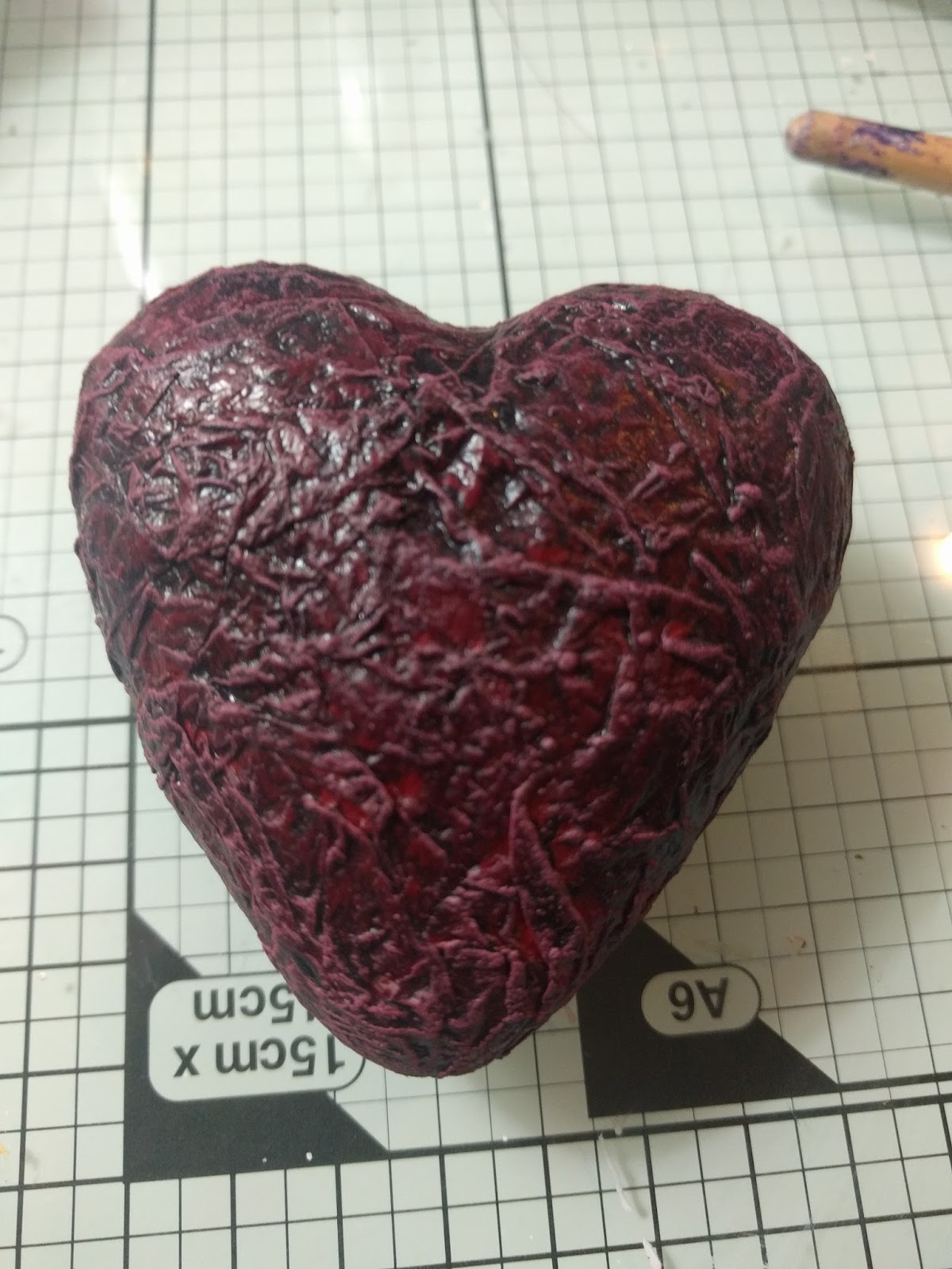
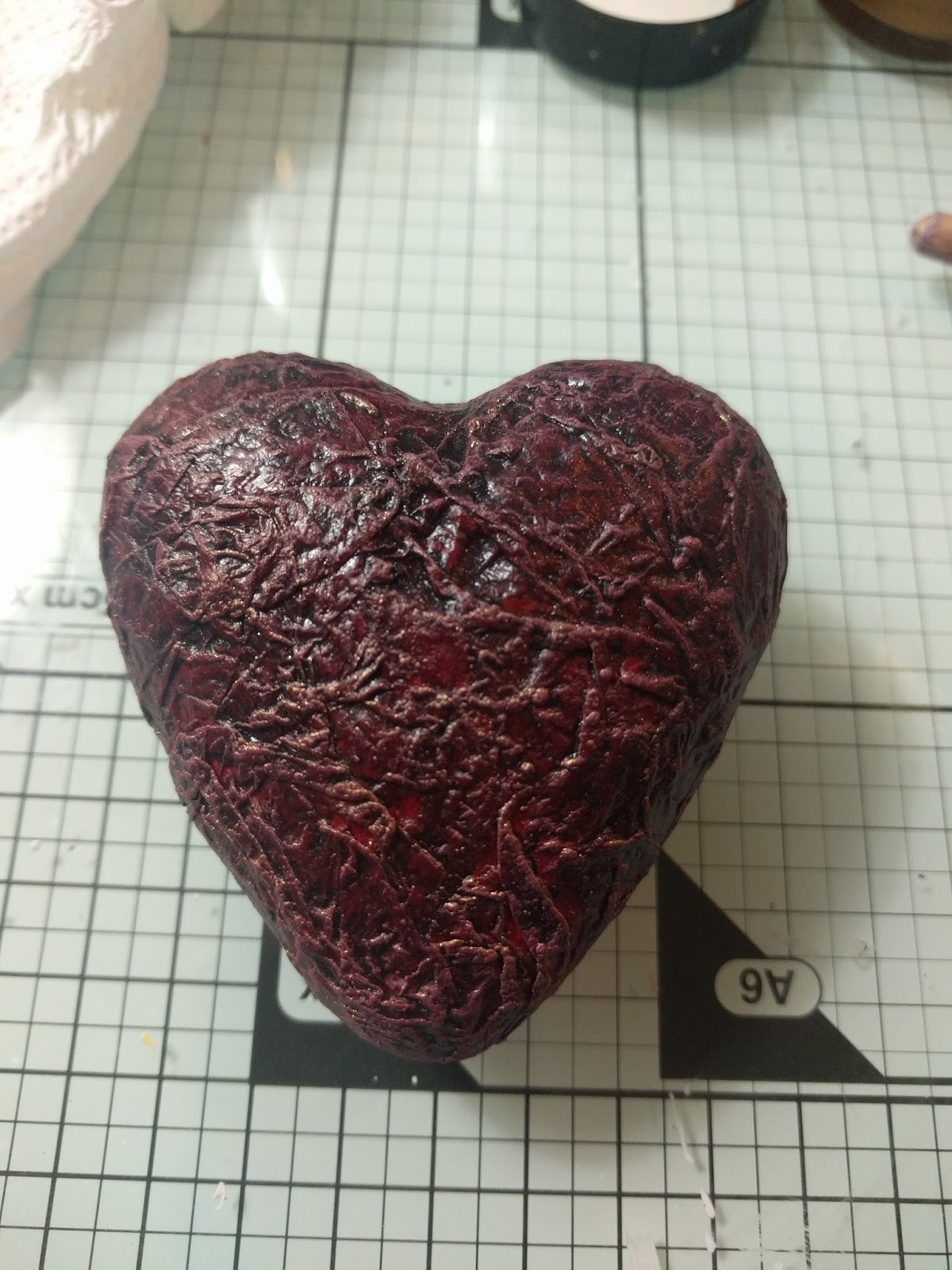
It's hard to convey in the photo just exactly how much texture there is on the heart, but it really adds something and is so simple to achieve.  I'd like to thank Mark Gould for introducing me to the technique (if you haven't heard of him then check out, his blog link is my front page).


So now onto the tutorial, as usual I will give the list of materials before we start:


The Works Wooden Heart Box

Tando Creative Wings and Cogs
Hobbycraft Self Adhesive Pearl Gems
Treasure Gold Gilt Wax
Crawford and Black Acrylic Paint - Crimson Red, White
Reeves Acrylic Paint - Deep Madder
Royal and Langnickel Acrylic Paint - Dioxazine Purple
Key shaped brad
Poundland Lasercut chipboard shapes
7cm Polystyrene Heart
White Tissue Paper

Small Bronze Key  (any key will do as long as its smaller than the size of the heart.  Mine was from Artful Days goodie box)

There are two parts to this piece, the box and the heart; we are going to start with the heart.


Firstly take your sheet of white tissue paper and crumple it up into a ball; unfold and crumple your ball at least four times.  Once you have uncrumpled your ball for the last time, tear the tissue into segments.


Take some Mod Podge and cover your heart with it, try not to put too thin a layer on.  When you have the Mod Podge on take one of your tissue segments and lay it over the heart making sure that you retain the crumples.  You may need to use some more Mod Podge to stick the tissue down.  Repeat with additional tissue segments until you have at least two layers covering your heart.  You can then either set this aside to dry or use a heat gun to dry the glue.  If you decide to use the heat gun then don't hold it too close or on one place too long or you may cause the Mod Podge to bubble.


Once your glue has completely dried, paint over the tissue paper with the Crimson Red paint making sure to get into all the nooks and crannies of the crumples.  If you need to, add a second coat of this colour to ensure that you get a good coverage, the put aside to dry.


Taking some of the deep madder, paint a patchy layer over the red ensuring that some of the base layer shows through.  This only needs to be a thin layer so it should dry quite quickly and you can move onto the next stage.


Make a very loose wash using the Diox purple and paint this over the entire surface of the heart making sure that you get some pooling in the nooks and crannies.  Dry this layer using your heat tool  (this is an important step as it really sets the grunge texture).  Its this combination of colours and wash that really gives it that raw heart look, you could stop here but following on with the dry brushing really enhances the look.

What follows next are a number of photos showing the progressive dry brushing of the heart which I will explain after the photos.


Put some of the deep madder onto your palette and add a little white to it and mix.  Take a stiff brush and load it with a small amount of the paint, then wipe most of it off onto a paper towel.  This may seem counter-intuitive to load up and then wipe off, but dry brushing needs to be down subtle and works best with the gentle addition of layers of paint.

Once most of the paint is off the brush then start brushing it over your heart,  if you start seeing paint in the areas between the crumples then you have too much paint on your brush, and you need to wipe more of it off on your paper towel.

You need to repeat this dry brushing technique at least four more times each time adding a little more white to the paint you've already mixed.  As you move through the lighter colours you should see the paint building up on the ridges of the crumples highlighting the texture (this is the effect that we are trying to achieve).  It is up to you how light you go, but in this case you don't want to end up with pure white, so I would suggest a total of 5 layers of dry brushing should be enough.

When you are happy that you have enough layers of dry brushing clean off your brush and set the heart aside to dry for about 10 minutes.


After the 10 minutes have passed tale the same stiff brush that you used for the dry brushing and make sure that it is really dry before continuing.  Dip the brush into the Treasure Gold wax and again wipe it on a paper towel to take off the excess.  Dry brush this wax over your heart and you should see that it really accentuates the dry brushing you did in the previous steps.  Again how many layers of wax you add is up to you but I would suggest subtly and only do one to two layers.

From here it is just about adding embellishments to your heart, I didn't want to add too many as I was going to be using the box to hold everything and complete the look.

Take some fine black chain and loop it around your heart and through the loop on your key, securing it at the back with a pin or staple.  I used a jump ring that I cut in half and pushed into the heart to secure the chains and prevent them from slipping.

This is the end of the heart part of this piece.

Moving on to the box, I can't say too much as it is based on techniques developed by Andy Skinner and people have paid to do his course (link at the end of this post, and I highly highly recommend you do it.), but I can give you some general tips in its decoration.


Take an ordinary wooden box and add some self adhesive pearls to act as rivets (these are all going to be covered in gesso later so it doesn't matter what colour they are)


Add some embellishments to all sides of the box, sticking them down using tacky glue.  I have used these laser cut chipboard shapes from Poundland to add my interest.


Again stick down the wings from the wings and cogs set using tacky glue.  To make sure that they don't overlap the outside of the box you need to overlay them over the heart aperture.

Once all of the embellishments have been stick down and are dry, remove the acetate from the box aperture and discard.  The idea is to be able to feel and really see the texture that you created on the heart without opening the box.

The next stage is to cover all of the box both inside and out with black gesso.  This will give you a good base to work from and even out all of the different surfaces.  In order to get a good covering you may need to use several coats of gesso (once you have painted the inside do not close the box until the gesso is fully dry or it will stick shut).  Depending on what kind of embellishments you have used you may need to use some smaller brushes to get in to the nooks and crannies.

Its the painting stage of this process that I can't really talk about (although I can show you some pictures of the completed stages), but suffice to say it involves several layers of dry brushing over the textures and embellishments to create that typical aged metallic Steampunk look.

There are several tutorials online which can give you the basic colours for creating aged metals using acrylic paints (Pinterest is a good source of inspiration).


If you wanted to add more texture to your box, then before you start the dry brushing stipple two layers of gesso over the entire surface drying between each layer.

I know this has been a long post but I hope that you've enjoyed the process and learned a few things along the way.


Any questions or comments leave them below.

Good Bye Until Next Time.

Sunday, 5 February 2017

Art Journal Prompts: Week 04 - Life is and Week 05 - Take Two

Good Evening All.

I've got two lots of pages to share with you today; both are relatively simple without lots of steps so I'm going to show you the final image and then give a brief overview of how I created them.

Week 04 - Life is....


Memento Ink Pad - Black
Memento Teardrop Ink Pad - Pinks, Purples, Blues, Greens, Yellows
Papermania Embossing Powder Purple
Paperartsy Rubber Stamp - Everything Art 03
Marianne Design Clear Stamp Distressed Linen 
Marianne Design Clear Stamp Eline's Brush
The Works Wooden Alphabet Stamp

Stamp the distressed linen stamp in light coloured beige ink as the first layer.

Once dry stamp each word with the black memento and then double emboss each with the purple embossing powder.  In my picture it does look very black, but in real life there is more of a purple tinge to it.  You could make it more purple by stamping using a versamark ink pad.

After all the embossing was done let the page cool down before proceeding to the next step.

Use the brush stamp set and the various different shades of memento to cover most of the rest of the background, finishing off by stamping the paint brushes from the Paperartsy set.


Week 5 - Take Two....

For this page I decided to turn the prompt into a negative about not being able to take two different choices at once.


Stampscapes Stamps UK Site US Site
Ranger Archival - Jet Black
Memento Teardrop Ink - Blues, Greens, Browns
White Gel Pen
Colourbox Stylus Tools

Trim a sheet of glossy cardstock down to fit in your journal (using glossy cardstock gives the page a much shinier finish and also makes it easier when working with the inks to colour).

Take  the various different sizes of the pine trees and start off by stamping in the middle of the page.  As you stamp more of the trees moving up the page and out to the edges, make sure that you overlap them as trees would be in real life.  The aim is to create a shallow triangle shape to act as a split in the forest road.

Using the same stamps, stamps overlapping trees on the bottom corners leaving a gap at the very bottom of the page between the two corners.

Take the grass stamp and cover the whole area from the bottom of the page up to the lower branches on the top most tree you have stamped.  Make sure that you overlap as you stamp so that there are no harsh lines where you have reused the stamped image.

Give everything you have stamped so far a quick blast with a heat gun to set before moving on.

Take the moon and mist stamp and stamp it near to the top right of the image.  Using the cloud stamp stamp clouds all around the moon and down to where you stamped the grass.  Again make sure that you overlap your cloud stamping to avoid the hard lines.

Using the Colourbox stylus and the memento inks colour the image in.  (check out this YouTube link for the Stampscapes designer showing you their use: https://www.youtube.com/channel/UCnLPP_MKTXGyBYr8_PjkJvQ)

Once the image is all coloured in and dry, add some highlights using the white gel pen.

Finish up by stamping your quote in white ink.  To ensure that you don't smear the ink once it's dry give it a light coat with some cheap hairspray.

I hope that you've enjoyed learning about how I have created these two pages.

I've got something a little different planned for my next post so keep your eyes peeled for that coming up.

Good Bye Until Next Time


Saturday, 4 February 2017

Wanderlust - January Round Up

Good Morning All.

Today I'd like to talk a little about the online course that I am doing this year, firstly I'll explain a little of what its about and then ill show you some of the pieces I've created from it.

Its called Wanderlust and it's run by two talented artists, Kasia and Jamie Avery from Everything Art.  I'll put a link at the end of this post so that you can check it out.

Here is a little snippet from their website to explain what Wanderlust is:


Wanderlust is a whole year long journey - an online event offering you videos from 24 guest teachers and 2 resident teachers on a weekly basis (each one is full length, high quality and downloadable), access to the Wanderlust Community with a supportive and friendly atmosphere, where all of the classes are gathered. 
You will also find there various activities that will stimulate your creativity and motivate you to simply enjoy the process of making art. Together with the class you will also get an exclusive whole year discount to leading art and craft retailers all over the world.
Wanderlust class is the perfect alternative to in-person classes!!

The course has only been running for four weeks now with the fifth week starting yesterday.  I'm really enjoying it though; with each of the tutors so far there have been many different styles of work portrayed, each with different ideas and reasons behind those ideas.

Each week they release a new video with that week's class on it and and accompanying PDF for reference.  Every fourth week they release a new set of games and challenges to take part in with a chance to win a nice prize.

Now onto the pieces that I have created:


Both of these pieces were from Week One, the picture on the left was my overall statement for the year, with the picture on the right a slight expansion on one element of that.


These pages were from Week Two; the premise of which was to let yourself go and keep adding layers and interest to your work until it 'feels right'.  I must admit that I did struggle with this piece because the way I work it much more planned and thought out rather than feeling as I go.  This is why I have two pages for this week because I decided to try again and just see what would happen with the supplies that I had to hand.  I think that they both turned out ok though in the end.


These three pages were from Week Three, and a complete change of style from the first two weeks.  Week Three was all about repetition and how you should be afraid to use it as you can create such different pieces using the same image.  As you can see from the three pages I have used the same image in each page that I initially drew for the first page.  In the second page i have rotated and mirrored the image and in the third page it's simply mirrored.


This page although part of the Wanderlust course forms a different element to the other pages I have showed so far.  This page belongs to the Wanderlust Book, which is a prompt based art piece with a new prompt being released every month.  This month's piece was based on the phrase 'I am ready...'


My final page for this blog post is my January challenge piece; we had to pick three colours that we could see outside plus black, white and gray and only use those colours to create a page that told a story of January.

I hope that you've all enjoyed seeing the pieces that I have created for Wanderlust;  if you haven't joined up yet then I highly recommend that you do.


Good Bye Until Next Time

Thursday, 2 February 2017

Art Journal Prompts: Week 03 - Music

Good Morning All.

Welcome to another instalment of my blog.  This post is going to be about my week three Art Journal Prompt.

My piece is based on this Plato quote which I found on the internet:

Music gives a soul to the Universe, wings to the mind, flight to the imagination and life to everything


As usual I will give you a breakdown of the materials used before we start the step by step.

Charity Shop - Old music book
Watercolours - Black, Purple, Blue, Orange, Yellow
Acrylic Paint - White
Ranger Archival Ink - Jet Black
Ranger Distress Ink - Vintage Photo
Acrylic Paint Marker
Mod Podge
Finnabair Art Basics Heavy White Gesso
Walnut Ink Crystals


Squeeze a small amount of the gesso out onto your page and spread it completely over using an old credit/gift/loyalty card.  This will help to give the page a bit of body when we start adding other mediums on top.  As its such a thin layer it should dry relatively quickly, but you can give it a quick heat with your heat gun if you cant wait.


Tear sections of the music sheets from the book (make sure to have some sections with the verses and some from the opening sheet to add interest), and use Mod Podge to stick them down to your book.  You don't want any harsh straight edges so if you're using a section from the edge of a book then tear that edge slightly to soften it.

While this is drying dissolve some of the Walnut Ink Crystals with some water and decant into a mister bottle.    You don't need to use lots of the crystals at once as the colour is pretty strong (probably about 1/8th to a 1/4 of a teaspoon should be enough).  It is better to use multiple layers of spray to darken rather than making it too dark initially as is it not really possible to recover if you make it too dark. It should take about five minutes for all of the crystals to dissolve completely in the water.


Sprinkle a few extra crystals in the areas that you want darker age spots, then spritz the page with the crystal spray.  If the areas with the extra crystals are a bit dark then you can dab them lightly with some paper towel while it is still wet.  Allow this layer to dry completely before moving onto the next stage.


Working from the darkest colour to the lightest paint stripes of the watercolours across the page, making sure that you blend the colours as you transition between them.  You want to keep the colours fairly watery like a wash so that you can still see the music behind the paints.  Again wait for this layer to dry before moving onto the next.


Take a small amount of white acrylic paint onto your mat and dilute it with plenty of water, you want quite a wet sloppy paint.  Dip an old toothbrush into this mix and use it to splatter paint over the darkest areas of your page (these are going to represent the stars in the universe mentioned in the quote).


Using the black archival stamp the floral/garden stamp at the bottom of the page, and the birds on the branch just below the purple segment of your page.


Use the paint marker to add highlights to the stamped images; this gives them some POP and makes them stand out from the background.  Be mindful of where you are adding your highlights though.  As this is a sunset scene I have added all of my highlights to the bottom and the left of the images.


Add in your quote using the paint marker, or if you prefer you can stamp the quote using a white ink pad.


Add some musical notes to your page around the the bird branch area to finish everything off.  If your notes don't quite show up properly you can add an outline using a white pen.

Hope you've enjoyed this tutorial, and any question leave them in the comments below.

Good Bye Until Next Time