Monday, 27 March 2017

Art Journal Prompt - Week 12: Adventure

Good Morning All.

This week's prompt was Adventure.  Now Adventure is one of those words that can mean different things to different people.  I did discover though that in the course of my research for this prompt that most people relate this to travel or something similar.  I didn't want to look at this interpretation of the prompt as some of my other pages that touched on this and therefore I wanted to look at something different.

I did come across one quote that spoke to me as I am a bibliophile and it seemed to fit perfectly with the prompt.

The quote that I used was:


To You Its Just Another Book, But To Me Its A New Adventure


Materials:
Scrapberrrys Words Live Forever - 7th Street Library, Memos, Records
Ranger Vintage Photo Ink Pad
Ranger Archival Ink Pad - Black
J Herbin Violette Pensee Ink
Vintage Ephemra
Paper scraps
Indigoblu Script Stamp
Bobunny Stained Textures Stamp


Cut your sheet of 7th Street Library paper to fit the size of your journal.


Cut a strip of the Records paper that is one draw wide, then cut out the Due date and the index card elements from the Memos paper.


Distress around all of the edges of the Memo elements and edge with the Vintage photo.


Using the Stained Textures mug stamp, add some random distress staining to the cards to make them look older and worn.  Add the quote to the index card using the purple ink.

Cut a strip of paper as high as you want your stack of books, in my case it was approx 8cm long by approx 2cm wide.  This strip is going to act as the backbone for the stack of books.


Cut strips of your scrap papers in various widths and lengths and stick them to the backbone using double sided tape.


Using your remaining scraps cut some small strips to act as book bands and stick those on using High Tack double sided tape.  Using the script stamp and the black archival stamp some text along the 'book' spines to act as titles.

Using a paintbrush, curve each book in the book stack to give the impression of a spine and dimension.


Stick down each of the elements down on the page using double sided tape, except for the book stack.  Use foam pads on the books as this will help to preserve the dimension that you have created.

Any questions or comments, please leave them below.

Good Bye Until Next Time

Wednesday, 15 March 2017

Technique Tags

Good Afternoon All.

For this post I am going to be showing you a number of sample technique tags.  Some of them are from paid courses so I wont be able to say too much about them but I will indicate the course link for you to go and have a look at them, the rest I will explain the techniques used.


This first group of tags is from Andy Skinner's Time Worn workshop.


Course Link: http://timeworn.andyskinnercrafts.com/


Course Info: In this workshop you will discover a variety of time worn techniques including various stages of rust, old tin, leather, chipped paint, aged ivory, burnt copper, copper patinas, peeled weathered paint, distressed wood, steampunk techniques and old floorboards, there are 20 in total plus a variety of texture techniques


This second tag is from Andy Skinner's Book of Ruination Workshop.

Course Link: http://bookofruination.andyskinnercrafts.com/ includes Rock My Book Workshop


Course Info: Both The Book of Ruination and Rock Your Book workshops can be completed on most hard surfaces such as wood, papier mache, and hardback book covers etc. This means you can use the techniques to alter a whole host of items.


This is one of my favourite techniques to use on altered boxes.  Due to the techniques employed in its construction each time you do it you will end up with a different result.  You can achieve such different ends just with the different colour combinations that you choose.


The third tag is from Andy Skinner's Book of Secrets Workshop.


Course Link: http://bosw.andyskinnercrafts.com/index.html


Course Info: This altered box is constructed around a book shaped wooden box which has a secret drawer, you will be using acrylic paint and mixed media techniques to complete the overall Steampunk look.


This technique is another one that I have used quite often to create altered boxes

This final grouping of tags comes from live demonstrations on HOCHANDA and YouTube.

Distressed Metal


Materials
Decoart Metallic Silver
Decoart Paynes Gray
Decoart Quinacridone Gold
Decoart Transparent Yellow Iron Oxide
Salt

- Cover your tag with metallic silver paint and allow to dry
- Make a loose wash using Paynes Gray and cover your tag with it.
- Whilst the wash is still wet, sprinkle the salt over making sure that there is a heavier concentration in some places.  Leave to dry completely.
- When everything is completely dry, brush all of the salt off of the tag.
- Lightly brush some of the Iron Oxide over the tag (this will add some brightness to the rust)
- Make a wash of the Quin Gold and brush this over the surface of the tag.
- If you want it darker around the edges add another layer of the Quin Gold wash.

Texture Tag


Materials
White Tissue Paper
Mod Podge
Decoart Carbon Black
Metallic Gold
Metallic Copper
Viva Decor Inca Gold - Old Silver

- Scrunch up the tissue paper and unfold (repeat at least 3 times)
- Cover your tag in Mod Podge and stick your tissue down making sure that you have lots of wrinkles.  Allow to dry completely.
- Cover your tag with the black acrylic and allow to dry (you may need to do two coats to completely cover all of the tag).
- Heavily dry brush the metallic gold over the entire surface.
- Dry brush the metallic copper over the entire surface to highlight the texture.
- Lightly dry brush the Inca Gold over the very tips of the texture.

Mod Podge Resist


Materials
Mod Podge
Decoart Paynes Gray
Decoart Quinacridone Gold
Salt
Stencil
Sponge

- Dab the Mod Podge through your stencil onto the tag, making sure that you get a good even coverage.  Allow to dry completely.

NB: You could also use a stamp to stamp the Mod Podge rather than using a stencil.

- Make a wash using the Paynes Gray and paint this over the tag. Whilst the paint is still wet, sprinkle with some salt and allow to dry.
- Once everything is dry brush all of the salt off the tag.
- Paint a layer of the Quin Gold over the tag and allow to dry.

Note how the Mod Podge resists the bulk of the paint and creates a distressed look.

You could further enhance this tag by adding in a little of the Decoart Texture Sand paste before painting with the Paynes Gray.  This would help to add another layer of texture in addition to the one added by the use of the salt.


Mega Crackle / Glitter Crackle


Materials
Acrylic Paint (your choice of colour)
Weathered Wood
Decoart Crackle Paste
Glitter (your choice of colour)
Mod Podge

Mega Crackle
- Base coat your tag in your choice of acrylic paint and allow to dry
- Cover your dry tag with a layer of the weathered wood and allow to dry completely (DO NOT Heat Dry)
- Paint a layer of the Crackle paste over (the thickness you paint will determine the size of the cracks. i.e the thicker you paint the bigger the cracks).  DO NOT overwork the paste as it will affect the crackling and DO NOT heat dry.

Glitter Crackle
- Base coat your tag with Mod Podge and cover heavily with glitter and allow to dry
- Cover the glitter with a layer of Mod Podge and allow to dry
- Cover the tag with a layer of the weathered wood and allow to dry completely (DO NOT Heat Dry)
- Paint a layer of the Crackle paste over (the thickness you paint will determine the size of the cracks. i.e the thicker you paint the bigger the cracks).  DO NOT overwork the paste as it will affect the crackling and DO NOT heat dry.

Once the cracking has completed you will be able to see the glitter shining through the cracks.

Distressed Panel


Materials
Decoart Quinacridone Gold
Decoart Crackle Paint
Vaseline/Hair Clay

- Base coat your tag with the Quin Gold and allow to dry.
- Apply a small amount of the Vaseline or hair clay where you want the chips to appear (you don't want to apply it too thickly).
- Brush a layer of the Crackle Paint over the tag (you need to load up your brush and use a light touch to paint this layer.  The idea is not to go over an area where you have already deposited paint).  Leave this until completely cracked before moving on to the next step.
- Take a cloth and rub back the areas where you applied the resist
- Make a loose wash using the Quin gold and paint this over your tag to age it.

I hope this gives you a little insight into some of the things that you can make.

Any questions or comments please leave them below.

Good Bye Until Next Time

Tuesday, 14 March 2017

Art Journal Prompt - Week 11: Sparkle

Good Morning All.

This weeks prompt was Sparkle!  It was the perfect opportunity to get out all of the glitter and shiny things.

As is my want I searched through Google to try and find some quotes which related to the word of the week.  Most of the ones that I found were very similar and quite normal for the prompt.  Knowing me as you do by now, I wanted something that was a bit different so that it would stick out.  After extensive searching I did manage to find the perfect quote that fit with the word.


"A Unicorn don't stand around and worry what the other Unicorns think.  It just Sparkles!"


Materials
Glitter
Steel Blue Embossing Powder
Metallic Pen - Gold


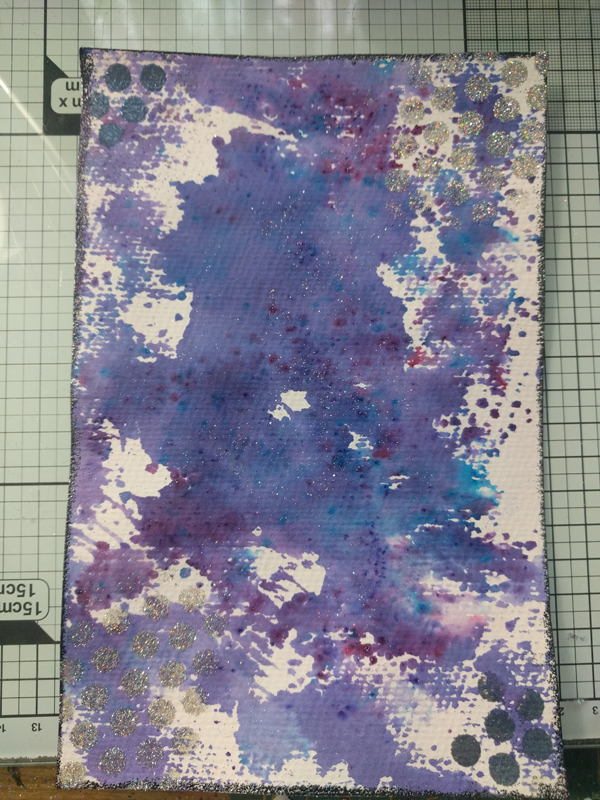
To start with you need a sheet of water colour paper cut to size for your journal page.


Sprinkle your Brushos on your mat and spritz with water to activate the crystals, then swipe your page through the paint.  You may need to swipe through several times to get a good coverage of your page (note you don't want to completely cover your page with the Brushos).

Whilst the page is still wet, sprinkle your glitter over (you need to use really fine glitter for this part).


Using a dots stencil and the versamark, dab through and make some circular marks on two diagonal corners.  Cover the ink with the steel blue embossing powder and heat to set.


Repeat the dots with the versamark on the remaining two corners and using the same fine glitter that you sprinkled on the page.

Spray a couple of thin layers of spray and shine over your page to ensure that the glitter remains stuck down.

Edge your page with versamark and the steel blue embossing powder.

This next part I don't have pictures for but its quite easy to do.

Cut our your unicorn shape ( I used this one) and cover with the versamark ink (make sure that you've got a good covering).  Use the UTEE over the wet shape and use a heat gun to melt this layer.

Allow the UTEE to cool and repeat with another layer.

Again allow the UTEE to cool and repeat with one final layer of UTEE, sprinkling some of the glitter over this layer before melting.


When everything is cool stick your Unicorn down to your page using Tacky Glue and write your quote out using the metallic pen.

Any questions of comments please leave them below.

Good Bye Until Next Time

Monday, 6 March 2017

Art Journal Prompts: Week 10 - Magic

Good Morning All

This weeks prompt was Magic.

Magic can conjure up a number of different possible interpretations, from Harry Potter through to mythical creatures like fairies.  I didn't want to go down this route for my journal page.  I decided that I want to go back in time and look at a more historical representation of Magic, so I had a look at Alchemy.

To give you a bit more of an insight into Alchemy here is a quote from livescience.com:


James Randi notes in his "Encyclopedia of Claims, Frauds, and Hoaxes of the Occult and Supernatural," "Beginning about the year 100 and reaching its flower in medieval times, alchemy was an art based partly upon experimentation and partly upon magic. Early investigators of natural processes centered their search on a mythical substance they knew as philosopher's stone, which was supposed to possess many valuable attributes such as the power to heal, to prolong life, and to change base metals into precious metal — such as gold."


These are the elements that I wanted to bring to my page.


Materials
Ranger Distress Ink - Vintage Photo, Walnut Stain
Metallic Brush Markers
Metallic Writing Pen - Gold


Cut out your images, and edge them using the walnut stain ink pad.  Using a dauber, add a little vintage photo ink around the edges of the image, bringing it towards the centre.  Scrunch up each picture and unfold (this gives the appearance of being handled many times).


Glue all the images down to the page using Mod Podge, being sure to overlap them.


Using the dauber, add more walnut stain ink around the edge of the whole page.

Sprinkle a few of the walnut ink crystals onto your page, and spritz with water allowing a few moments for the crystals to dissolve and run.  If it starts to look like it may end up a little dark then you can use some per towel to sponge up some of the ink.


Using the table below and the brush pens, add some symbols along all four edges of the page.  It will add more interest if you use two different colours of pens to do this.


Add your quote in using the writing pen and you are finished.

I am including here the images that I used for my page to save you looking through Google for them.


Any questions or comments on this page, leave them below

Good Bye Until Next Time

Sunday, 5 March 2017

Wanderlust - February Round Up

Good Morning All

Here we are again, time for another month's roundup of Wanderlust.  There have been some really interesting classes this month, and different ways of looking at things.

If you haven't already signed up I would definitely encourage you to do so, there is plenty of time to catch up with the classes that you have missed so far.

I think it is time to move on and show you all what I have created this month.


This page was from week 5 and it was all about composition building and if focal points are necessary.  There are many different types of artist and types of art, not all of these need a focal point to be great works of art (as you will see with one of my later pieces).  We also learned about balancing our work by ensuring what was done to one side of the work must be done on the other side to create an equilibrium.


This was week 6's page, and was all about creating a love letter for someone that we cared about deeply.  We were introduced to a number of techniques including background composition and image transfer.  I enjoyed making this page as it really made me think about the layers in a project and how they can show through from one to the next or not.


These three pages were part of week 7 and they show the gradual progression from study through to a final art piece.

We had to study how nature looked, and see how it could be replicated in a simpler form using brush strokes.  The first page is a study in pen of what I could observe of the actual leaves and the patterns that they held.  The second is a study in acrylic ink trying to simplify the shapes yet still keep the look of nature.  The third and final page is my layered attempt at incorporating those simplified brush strokes and patterns into an abstract bouquet.

As you can see they are all very different pages, but I have enjoyed creating them all.  They are getting me to really think about my art and all the different styles that I can achieve.

That's all for this round up; any comments or questions leave them in the comments below.

Good Bye Until Next Time