Monday 20 February 2017

Art Journal Prompts: Week 08 - Spread Your Wings

Good Afternoon All

This weeks prompt was Spread Your Wings; this idea has several different connotations from exploring yourself to actually physical exploring of the world.  I wasn't entirely sure where I want to take my interpretation so I did some Googling to try and find an appropriate quote which would fit this idea.


Most of the quotes that I found were about exploring yourself and seeing how far you could take you, so this is what I went with.


The quote that I used was:


Until You Spread Your Wings You'll Never Know How Far You Can Fly

In the Facebook group that I do these prompts with, there are a number of different kinds of artists and crafters so I wanted to do a different technique that they may not have come across or tried before.  This technique was Caught in Crystal, which produces amazing different backgrounds every time it is produced.

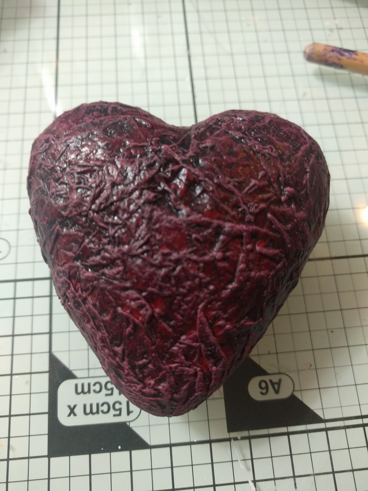
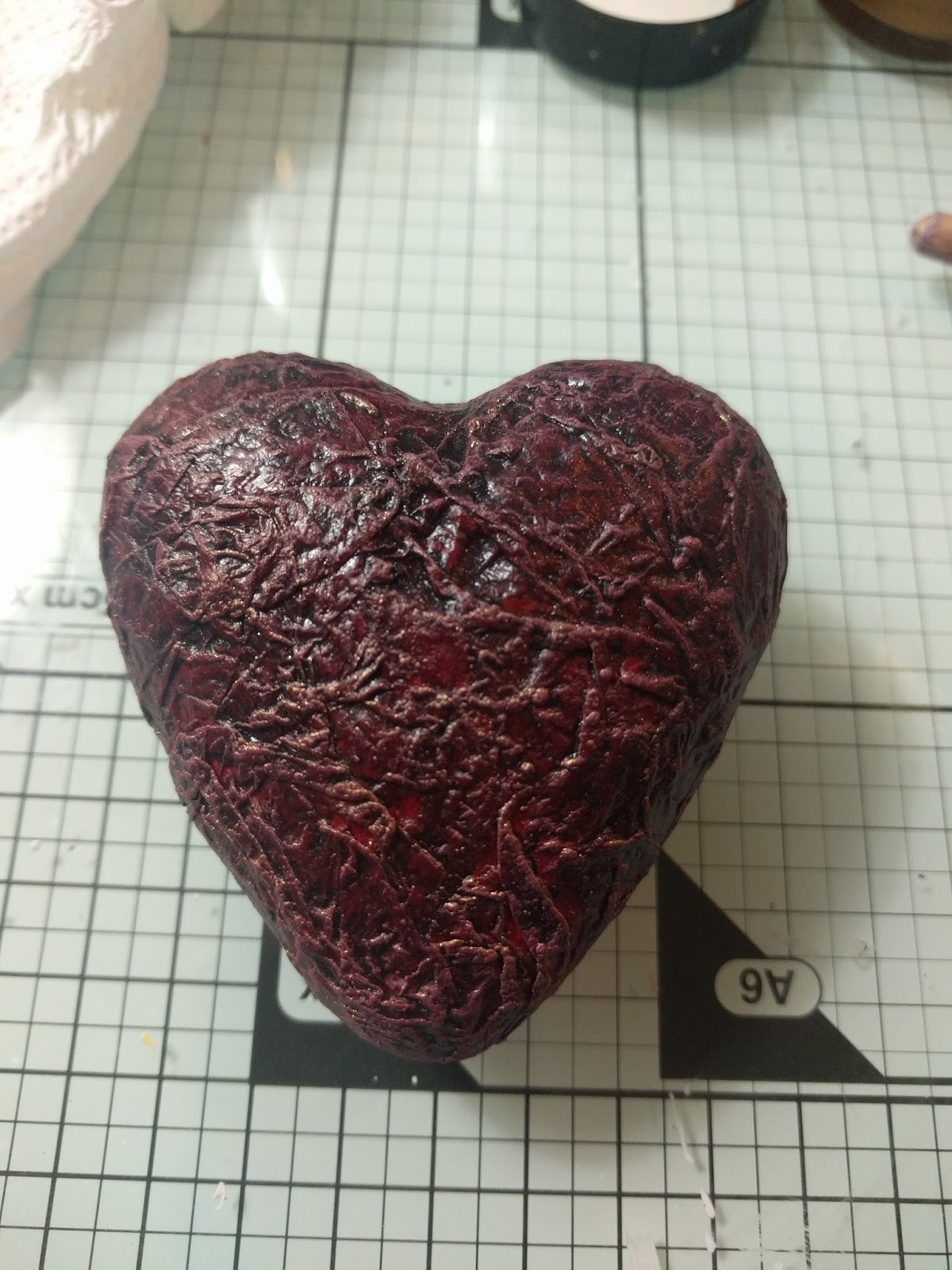
I have used Caught in Crystal before to create cards so I knew the perfect die cut to use to really highlight the effects.  You can see below the effect that it does create.


The materials used this week are:

PVA Glue
Acetate
White Tissue Paper
Mica Powders
Glitter - Gold, Silver
Stickit
Stazon Ink Pad - Black

I've chosen to go with a warm palette, though this would work just as well with a cooler palette, you just need to adjust the colours or mica powders and glitter to match.


Take a sheet of clear acetate and cut it to the size of your page.


Take your sheet of white tissue paper and cut it to about 1 cm bigger than your acetate and crumple it up into a ball; unfold and crumple your ball at least four times.

Cover your acetate with a thickish layer of glue (say about 3-4 mm).  Make sure that you spread it evenly over the whole surface.


Sprinkle the surface of the wet glue with your Brushos making sure to get a good distribution of the colours.


Lightly spritz the piece with some water to activate the Brusho crystals.  If you need to add more colour do so at this point to ensure the whole surface is covered with some colour.  Sprinkle your glitter and mica powders over the surface to add interest.

Sorry I didn't get a picture of the next step, but what you have to do is take your sheet of tissue paper and gently push it down into the glue so that all areas of the tissue are stuck down.

You'll now need to leave this to dry, due to the thickness of the glue this can take anywhere from a few hours to overnight.

Die cut two copies of your shape, one in black and the other in gold (if using a cooler palette silver would be better).  

Once your background has dried trim off the excess tissue paper to neaten the edges, then turn over and see what exciting background you have created.

Before you stick your die cut down hold it over the background to see which end of the background has the most interest showing through the shape.  

NB: As the die cut that I am using is quite an intricate one I am using Stickit to glue my shape down.


You want to stick your gold die cut down first as we are going to be using this as a shadow effect against the black.  Once the gold shape is down stick the black one down slightly offsetting it from the gold one.


Stamp your quote in black Stazon being careful not to smudge as you do.  Once fully stamped give it a quick blast with a heat gun to set.

Finish up by sticking your completed piece into your journal using high tack double sided.

Any questions or comments leave them below and I will come back to you.

Good Bye Until Next Time

Wednesday 15 February 2017

Art Journal Prompts: Week 07 - Fill Your Heart With.....

Good Afternoon All.

The prompt for this week was the phrase 'Fill Your Heart With.....'


I went for the quote:


"Fill Your Heart With What's Important And Be Done With All The Rest"

Like my Steampunk box that I did for the CROP challenge, I didn't want to go with something that was really bright and colourful for my heart sentiment so I went back to what I know which is dark and grungy.

One of my favourite Mixed Media artists Andy Skinner has done some amazing things with grungy hearts so took my lead from him to create this masterpiece:


It's got a really nice distressed background that looks like its been through the mill.  This and the crackled heart really I think go hand in hand with the quote that I used.

This weeks materials are:

Prima Heavy White Gesso
DecoArt Acrylic Paint - Silver Metallic, Quinacridone Gold, Paynes Gray, Pthalo Turquoise, Gold Interference
DecoArt Antiquing Cream - Carbon Black
DecoArt Crackle Glaze
Treasure Gold Gilt Wax - Renaissance
Table Salt
Silicone Glue


Firstly prime your page with some gesso to give some stability as we are going to be working with a lot of wet media today and allow to dry.


Paint a layer of the silver acrylic over the page ensuring that you have good coverage, then heat dry with a heat gun.


Make a loose wash using one drop of the Pthalo Turquoise and one drop of the Paynes Gray.  This stage of the process we need to work pretty quickly so that we get a reasonably even coverage on our page.  Using the wash cover the page entirely working in stripes from the top of the page to the bottom.  Sprinkle the salt over  the wash, more heavily in some areas than in others.

The salt technique is an old water colour trick to remove some of the colour in the small areas that the salt is present.  In our case we are using it to create the effect of pitting in the metal.

Normally you would leave this to dry naturally, however it can be heated with a heat gun if you can't wait.  Either way once the piece is dry rub all of the salt off (it can be kept for the stage further on in the process).


Make another wash using just the Paynes Gray; brush this on in even stripes again working from the top to the bottom of the page and allow to dry.  Don't worry about brush strokes as in this layer and the next we want them to show as they make the overall look of brushed metal.


Brush on another layer of the Paynes Gray wash and use an old dish sponge to streak it down the page, then allow to dry.  This will really enhance the look of the brushed metal.


Make a wash using the Quinacridone Gold and paint this over the page.  Working quickly sprinkle the salt left over from the first use over the the wet page and leave to dry.  Once dry again brush off the salt from the page (this time it can be discarded).


Using a fairly dry brush streak some of the Transparent Yellow Iron Oxide over the page to add some highlights and brightness.  You don't want to be too heavy handed with this as the colours wont create as nice a visual blend.


Stamp the quote using your Black Archival ink, then give a quick blast with a heat gun to ensure it is set.

We are now going to move onto the heart which is going to serve as the centre piece for our page.


Paint the heart with two coats of Deep Madder to ensure a nice even coverage; while the paint is still wet sponge on a little of the gold acrylic to add some interest.  If you go too heavy with the gold then you can sponge over a little more of the Deep Madder to tone it down.  Once this has all dried lightly streak on a little of the Gold interference paint, then allow the piece to dry completely.


Gently brush on a thickish layer of the crackle glaze over your heart.  Try not to work the glaze too much as you add it on as this can affect the crackles.  You then need to leave this to dry and crack, and depending on the relative temperature and humidity of the room it can take up to several hours.  DO NOT be tempted to heat dry this layer as you will stop the crackles from appearing.


Once the piece is completely dry and crackled, paint a layer of the Black Antiquing cream over the whole lot making sure that you get it down into the cracks.


Using a slightly moist paper towel wipe back the antiquing cream until it just shows in the cracks, then lightly streak with some of the Treasure Gold wax.


Take the wire and wrap it around the heart, making sure that you go through the bumps at least once.  You can as  you wrap the heart add some beads to create interest; if you do decide to add them then don't go for bright colours, use something which complements the overall tone.

Use some silicone glue to stick the heart down to your page (this encapsulates the wire ends and should stop them from poking through your page.

You will need to leave your page to dry for several hours so that the silicone glue can set off.

Any questions or comments on this weeks project leave them below.

Good Bye Until Next Time

Sunday 12 February 2017

Art Journal Prompts: Week 6 - Believe

Good Morning All

The prompt for this weeks was believe.

I decided to take a slightly different approach to this prompt as I already had an image in mind that I wanted to use.  This meant having a look around for a quote that fit my image, rather that looking for a quote to fit the prompt and then creating an image from that.

The technique that I have used for this page is simple but quite effective, especially when done in layers.  It's the layers in this piece that really make it and bring everything alive.


Decoart Black Gesso
The Range: Reeves Acrylic Paint - Yellow Ochre, Deep Madder
Wellworth It: Royal and Langnickle Acrylic Paint - Primary Yellow, Primary Magenta II, Cadmium Orange
The Works: Boldmere Acrylic Paint - Black, Crimson Red, White, Cadmium Red
The Works: Crawford and Black - Gold
Hobbycraft: Pebeo Studio Acrylic Paint - 356 Violet Blue, 360 Blue Black, 357 Green Blue

Start by covering your page completely in a coat of the black gesso and allow to dry (this will create a very flat matt black background).


Using a sponge (I used a sea sponge) sponge on some additional gesso to create some texture.  This is where we are starting to create the base shapes for our gas clouds.


With the background being so matte, sponge on a little of the black acrylic to create a few shinier areas for interest.


Now we start to add the colours into the mix.

Sponge on some of the blue black acrylic in the areas that you sponges on the additional gesso (remember to sponge off the excess paint on to a paper towel before sponging the page.  You want light layers that you can build up rather than really heavy layers which are harder to blend).

Before this layer is dry, sponge a little white acrylic along the edges of the blue areas to really enhance the cloud like appearance.  Subtlety is key here, you don't want too much white showing here as it would look really stark.


Sponge on some of the blue green acrylic over the previous blue areas concentrating on the centre of those areas.  You want to be able to see some of the darker blue underneath so don't cover the entire of the bottom layer.  In addition the blue green paint is quite strong and bright so you may have to sponge over the same area a few times to get it to blend with the other layers.


Make a loose wash of paint by mixing some of the white paint with some clean water.  Using an old toothbrush spray some of the wash over the page to make stars.  Although I have stars all over my page I have also concentrated a band of them going across my page to add further interest to the over all image.  Allow this to dry fully before moving on to the next stage.


Sponge on some of the crimson red acrylic making sure to  slightly overlap some of the blue areas, again being subtle with the sponging as the idea is not to cover the blue layers.


Sponge on a light layer of the Cadmium Red over the crimson, concentrating mainly along centre of the previous layer.


Using the primary magenta ii lightly sponge on a layer blending in the two previous red layers.  You can extend this sponging beyond the red layers to add the look of slightly distant gas clouds coming off the main body.


Using the toothbrush again add another layer of stars.  This is helping to create depth in the image as you can still see some of the previous layer of stars but with the intermediate layers of sponging some of them have been push back into the distance, Allow everything to dry fora few minutes before moving on.


Taking care as this is another strong colour, sponge a little of the violet blue over your red layers, this will help to add some highlight to the clouds.  If you end up adding too much then you can add a little of the primary magenta ii to tone things back down a bit.


Concentrating on the very centre parts of the red pink layers, sponge on a layer of the cadmium orange acrylic.  Once you have your main layer down sponge of the excess on to a paper towel and then go back to the image and sponge again to blend the orange in a little.


Add a layer of splattered stars and allow to dry.


Using the yellow ochre, sponge on a layer covering and blending with the orange and violet pink layers.  Although you are covering your previous layers you still need to sponge lightly so you don't completely obliterate those layers.

Finish off with a final layer of stars made from the gold paint.

Hope that you've enjoyed following me through this tutorial, as usual any comments, thoughts, questions etc leave them in the comments below.

Good Bye Until Next Time

Monday 6 February 2017

CROP Challenge - LOVE

Good Morning All.

This is a long post with lots of pictures


This month's challenge at my local CROP was LOVE.


Now when most of you think about love, you will probably immediately be thinking cutesy and fluffy with lots of bright reds and pinks all over the place.  Normally I would be too, however I wanted to do something a little different and alternative for this challenge that would still get the message across.


To achieve this I went for something a lot darker, and a bit more Steampunky than you might expect.


This was my final result, I think the overall look is really cool and grungy and the heart inside really tactile and apart from the shape totally lifelike.


It's hard to convey in the photo just exactly how much texture there is on the heart, but it really adds something and is so simple to achieve.  I'd like to thank Mark Gould for introducing me to the technique (if you haven't heard of him then check out, his blog link is my front page).


So now onto the tutorial, as usual I will give the list of materials before we start:


The Works Wooden Heart Box

Tando Creative Wings and Cogs
Hobbycraft Self Adhesive Pearl Gems
Treasure Gold Gilt Wax
Crawford and Black Acrylic Paint - Crimson Red, White
Reeves Acrylic Paint - Deep Madder
Royal and Langnickel Acrylic Paint - Dioxazine Purple
Key shaped brad
Poundland Lasercut chipboard shapes
7cm Polystyrene Heart
White Tissue Paper

Small Bronze Key  (any key will do as long as its smaller than the size of the heart.  Mine was from Artful Days goodie box)

There are two parts to this piece, the box and the heart; we are going to start with the heart.


Firstly take your sheet of white tissue paper and crumple it up into a ball; unfold and crumple your ball at least four times.  Once you have uncrumpled your ball for the last time, tear the tissue into segments.


Take some Mod Podge and cover your heart with it, try not to put too thin a layer on.  When you have the Mod Podge on take one of your tissue segments and lay it over the heart making sure that you retain the crumples.  You may need to use some more Mod Podge to stick the tissue down.  Repeat with additional tissue segments until you have at least two layers covering your heart.  You can then either set this aside to dry or use a heat gun to dry the glue.  If you decide to use the heat gun then don't hold it too close or on one place too long or you may cause the Mod Podge to bubble.


Once your glue has completely dried, paint over the tissue paper with the Crimson Red paint making sure to get into all the nooks and crannies of the crumples.  If you need to, add a second coat of this colour to ensure that you get a good coverage, the put aside to dry.


Taking some of the deep madder, paint a patchy layer over the red ensuring that some of the base layer shows through.  This only needs to be a thin layer so it should dry quite quickly and you can move onto the next stage.


Make a very loose wash using the Diox purple and paint this over the entire surface of the heart making sure that you get some pooling in the nooks and crannies.  Dry this layer using your heat tool  (this is an important step as it really sets the grunge texture).  Its this combination of colours and wash that really gives it that raw heart look, you could stop here but following on with the dry brushing really enhances the look.

What follows next are a number of photos showing the progressive dry brushing of the heart which I will explain after the photos.


Put some of the deep madder onto your palette and add a little white to it and mix.  Take a stiff brush and load it with a small amount of the paint, then wipe most of it off onto a paper towel.  This may seem counter-intuitive to load up and then wipe off, but dry brushing needs to be down subtle and works best with the gentle addition of layers of paint.

Once most of the paint is off the brush then start brushing it over your heart,  if you start seeing paint in the areas between the crumples then you have too much paint on your brush, and you need to wipe more of it off on your paper towel.

You need to repeat this dry brushing technique at least four more times each time adding a little more white to the paint you've already mixed.  As you move through the lighter colours you should see the paint building up on the ridges of the crumples highlighting the texture (this is the effect that we are trying to achieve).  It is up to you how light you go, but in this case you don't want to end up with pure white, so I would suggest a total of 5 layers of dry brushing should be enough.

When you are happy that you have enough layers of dry brushing clean off your brush and set the heart aside to dry for about 10 minutes.


After the 10 minutes have passed tale the same stiff brush that you used for the dry brushing and make sure that it is really dry before continuing.  Dip the brush into the Treasure Gold wax and again wipe it on a paper towel to take off the excess.  Dry brush this wax over your heart and you should see that it really accentuates the dry brushing you did in the previous steps.  Again how many layers of wax you add is up to you but I would suggest subtly and only do one to two layers.

From here it is just about adding embellishments to your heart, I didn't want to add too many as I was going to be using the box to hold everything and complete the look.

Take some fine black chain and loop it around your heart and through the loop on your key, securing it at the back with a pin or staple.  I used a jump ring that I cut in half and pushed into the heart to secure the chains and prevent them from slipping.

This is the end of the heart part of this piece.

Moving on to the box, I can't say too much as it is based on techniques developed by Andy Skinner and people have paid to do his course (link at the end of this post, and I highly highly recommend you do it.), but I can give you some general tips in its decoration.


Take an ordinary wooden box and add some self adhesive pearls to act as rivets (these are all going to be covered in gesso later so it doesn't matter what colour they are)


Add some embellishments to all sides of the box, sticking them down using tacky glue.  I have used these laser cut chipboard shapes from Poundland to add my interest.


Again stick down the wings from the wings and cogs set using tacky glue.  To make sure that they don't overlap the outside of the box you need to overlay them over the heart aperture.

Once all of the embellishments have been stick down and are dry, remove the acetate from the box aperture and discard.  The idea is to be able to feel and really see the texture that you created on the heart without opening the box.

The next stage is to cover all of the box both inside and out with black gesso.  This will give you a good base to work from and even out all of the different surfaces.  In order to get a good covering you may need to use several coats of gesso (once you have painted the inside do not close the box until the gesso is fully dry or it will stick shut).  Depending on what kind of embellishments you have used you may need to use some smaller brushes to get in to the nooks and crannies.

Its the painting stage of this process that I can't really talk about (although I can show you some pictures of the completed stages), but suffice to say it involves several layers of dry brushing over the textures and embellishments to create that typical aged metallic Steampunk look.

There are several tutorials online which can give you the basic colours for creating aged metals using acrylic paints (Pinterest is a good source of inspiration).


If you wanted to add more texture to your box, then before you start the dry brushing stipple two layers of gesso over the entire surface drying between each layer.

I know this has been a long post but I hope that you've enjoyed the process and learned a few things along the way.


Any questions or comments leave them below.

Good Bye Until Next Time.